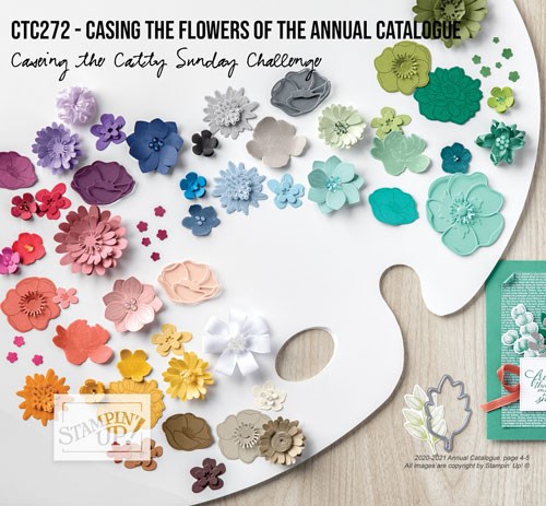
Hello and welcome to my blog. This week’s CASEing the Catty Challenge is to CASE the flowers of the Annual Catalogue. #CTC272 is only running for one week. There’s so many flower inspired creations in the Catty I had a hard time just choosing one. What will you share with us this week?
You may have hopped over from Julia’s blog, make sure you visit all the Design Team’s Blogs by clicking on the “next” button at the bottom of each post.
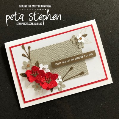
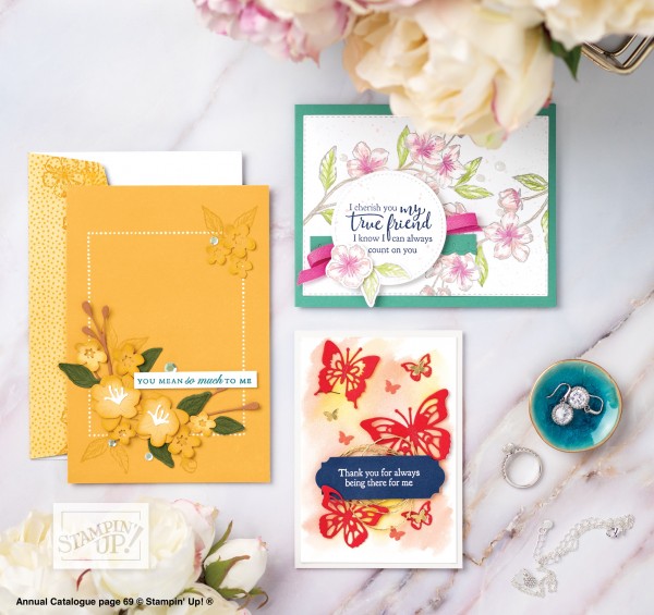
I chose the yellow card on page 69, not because I really liked it (yellow is not my favourite colour) but because I could see it would look fabulous in colours that were more my taste.
I changed the orientation of my card from portrait to landscape and also changed the colour from Bumblebee to Whisper White, Sahara Sand, Soft Suede and Poppy Parade.
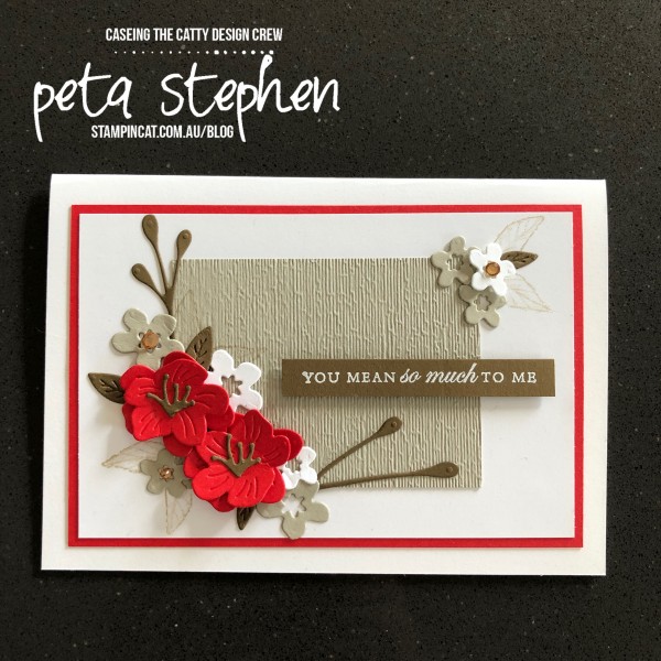
I’ve used the Subtle Embossing Folder on the small piece of Sahara Sand card stock then positioned my Cherry Blossom branch and flowers around the bottom left corner, as in the sample card.
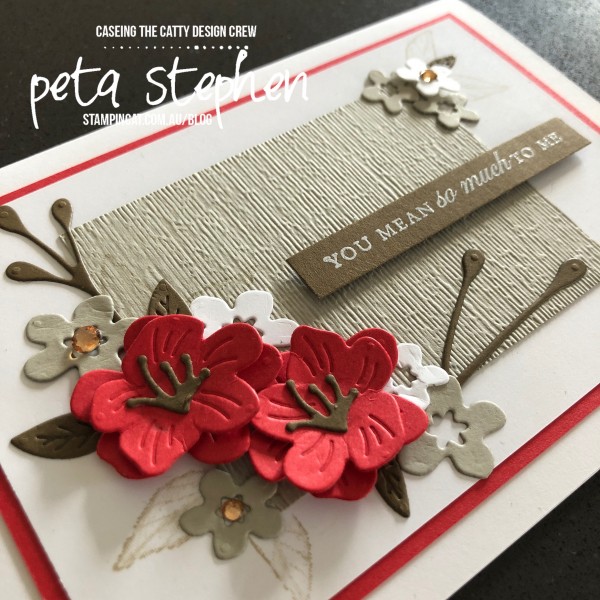
The sentiment is from the Forever Blossoms stamp set and is White Heat Embossed on Soft Suede card stock. The flowers and branch are from the co-ordinating Cherry Blossoms Dies. I’ve added a few Champagne Rhinestones to give my card a little bling.
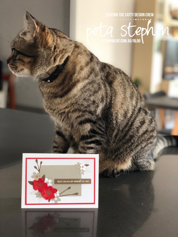
Marvi was a little disinterested in my card this week. He’d had a very busy day on Friday with the return of my card classes. He usually does a meet and greet at the front door so was probably tired after two classes in one day.
It’s time to hop over and see Tina’s wonderful creation. Just click on the next button below.
Thanks for stopping by.
Peta, your card is just wonderful.. I love the colours you’ve chosen! And that is an awesome layout for these gorgeous blooms.
Love your choice of colours, and the embossed panel is beautiful
How amazing it is with the change of colours, I much prefer your version Peta.
This is so beautiful, Peta – Marvi should look much more impressed than he does. It’s very different to anything else I’ve seen with the cherry blossom dies. I love the colour palette, the red really pops against the white and browns. Just gorgeous!!
Finally someone has used Yellow !
Thanks….and it is great…xxx
I like you version better than the original! Great colour combo and the cherry blossoms pop more against the different coloured background. Love the embossed panel too.
Oh I love the oriental look to your card. I need to case you for my friend who loves cherry blossoms!! I also love the colours you used.